MoveDetroit Brand StandardsLogo System

Logo System

The primary logo is the core identifier of MoveDetroit.

Logo System Overview01.1
Primary Logo
Secondary Logo
Primary Logo01.2

This is the primary logo in the MoveDetroit brand system. The primary logo is the core identifier of MoveDetroit and should be the logo used in all official brand communications, both print and digital, unless the secondary logo better accommodates the dimensions of the collateral piece in question.

Primary LogoConstruction01.2

The MoveDetroit logos are based on the Bold weight of the ABC Schengen Core typeface from ABC Dinamo, with customizations made to the lowercase letter ‘t’ so that it matches the cap height of the letters ‘M’ and ‘D’.

The primary logo combines the words ‘Move’ and ‘Detroit’ into one connected, camel case wordmark. It has a strong baseline alignment and is kerned with a repeated letterspacing unit (X) across the mark.

XXXXXX
Primary LogoClearspace01.2

Clearspace is the area around a logo that must remain free of text, graphics, or other visual distractions. It ensures the logo is always legible, prominent, and uncluttered.

The clearspace for all logos in the MoveDetroit logo system is the width of the letter ‘D’. The same clearspace rule applies to all brand foundation lockups.

Primary LogoPartner Lockup01.2

When the MoveDetroit logo needs to appear in conjunction with a partner logo, the dimensions of the partner logo will determine whether to use the primary or secondary MoveDetroit logo.

If the partner logo has a horizontal orientation, pair it with the primary MoveDetroit logo and separate the two logos with a thin bar.

MoveDetroit primary logo and Rocket logo separated by a thin bar
  • SpacingLogo, bar, and partner logo are each one ‘D’ apart
  • HeightBar and partner logo match the height of the MoveDetroit logo
  • Bar width½ X, half the letterspacing unit
Secondary Logo01.3

This is the secondary logo in the MoveDetroit brand system. The secondary logo is the supporting identifier of MoveDetroit and should only be used in official brand communications when its dimensions are better suited for the collateral piece in question.

Secondary LogoConstruction01.3

The secondary logo stacks and left-aligns the words ‘Move’ and ‘Detroit’. The distance between the two words is equal to the letterspacing unit (X) that is repeated across the primary logo.

XX
Secondary LogoClearspace01.3

The clearspace for all logos in the MoveDetroit logo system is the width of the letter ‘D’.

Secondary LogoPartner Lockup01.3

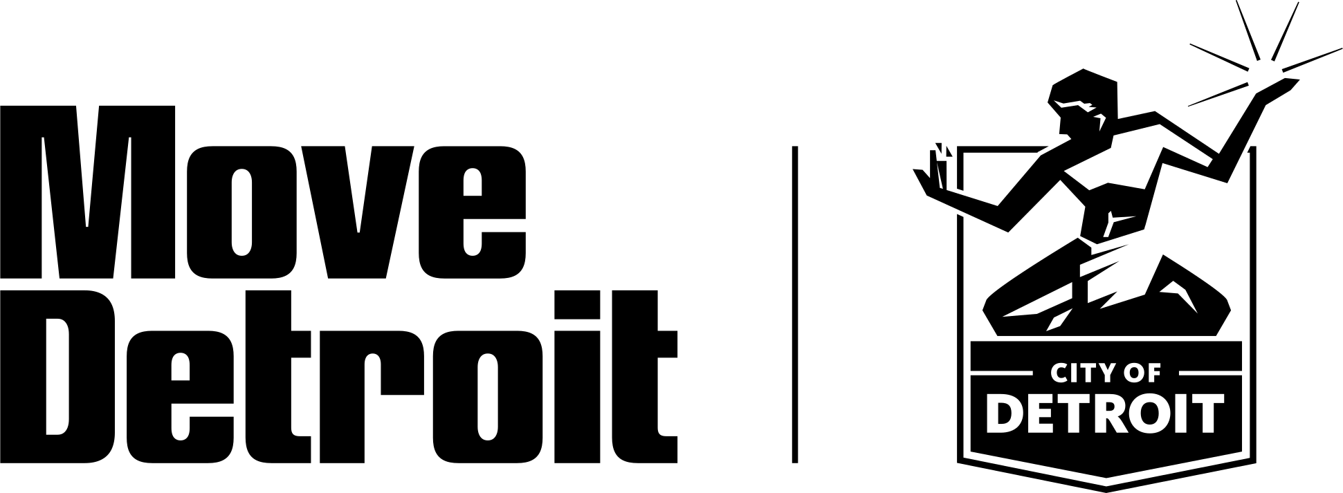
If the partner logo has a vertical orientation, pair it with the secondary MoveDetroit logo and separate the two logos with a thin bar.

The separating bar is top-aligned with the x-height of ‘Move’ and extends to the baseline of ‘Detroit’. Visually scale the vertical partner logo to create natural alignment points with both; parts of it may extend above and below the MoveDetroit logo.

MoveDetroit secondary logo and City of Detroit seal separated by a thin bar
  • SpacingLogo, bar, and partner logo are each one ‘D’ apart
  • BarFrom the x-height of ‘Move’ to the baseline of ‘Detroit’
  • Bar width½ X, half the letterspacing unit
Logo UsageMisuses01.3

To keep the MoveDetroit brand strong and recognizable, it’s just as important to know what not to do. Sticking to these rules helps protect the integrity of the brand and ensures that all branded materials feel consistent and professional.

01
This is the correct usage of the MoveDetroit logo.
02
Do not squeeze, stretch, or alter the proportions of the logo in any direction.
03Move Detroit
Do not typeset the logo in the brand typeface.
04
Never rearrange the logo or brand foundation in lockups other than those approved by the brand guidelines.
05
Do not add any effects to the logo, such as drop shadows, glows, feathering, etc.
06
Never show the logo in non-brand colors or non-solid applications of color (i.e. gradients).
07
Never use the logo as a clipping mask or place imagery within the logo.
08
Never place the logo on busy photographic backgrounds or patterns that provide insufficient contrast to the logo.
Brand FoundationLockups01.4

“Detroit Moves the World” is the MoveDetroit brand foundation and rallying cry. Therefore, it should be treated with as much intention as the MoveDetroit brand logos.

The following lockups are approved and are provided to fit a range of collateral dimensions. When placing text or graphics near a brand foundation lockup, follow the same clearspace rules as the logo.

Brand FoundationLogo Pairing01.4

When the logo and brand foundation appear together, a clear visual hierarchy is needed so they read as two separate brand elements rather than one phrase.

  1. 01The logo can appear next to the foundation if scaled down to (at maximum) 50% of the height of the ‘D’ in the foundation.
  2. 02The scaled-down logo can also appear knocked out, on a solid color field.
  3. 03MoveDetroit can also be typeset in the accent typeface (ABC Schengen A Mono).
  4. 04Do not place the logo and foundation next to one another at a similar scale.
01
02
03
MoveDetroit
04